
Walking down a grocery aisle today feels entirely different than it did just five years ago. Brands are fighting harder than ever for attention in an intensely crowded and competitive marketplace. And catching the consumer's eye instantly is exactly where expert food and beverage packaging design comes into play. It is no longer just about protecting the product inside. It is about telling a compelling story before a single word is read.
The thing is, consumer expectations shift rapidly. People want sustainability, aesthetic brilliance, and pure convenience all wrapped into one perfect box or bottle. To stay relevant, companies must adapt to these shifting visual landscapes. Here is exactly what we will cover in this blog: the top trends reshaping the industry, from innovative structural shapes and intelligent label strategies to the core elements driving consumer loyalty today.
The Core of Modern Food and Beverage Packaging Design
The market demands more than basic functionality. It demands an experience. Food and beverage packaging design has evolved into a strategic marketing tool. Every color, texture, and font choice acts as a silent salesperson.
And it works around the clock.
Brands are ditching generic templates. Instead, they invest in custom aesthetics that speak directly to their audience. Consumers actively search for products that mirror their personal values.
Shoppers crave authenticity and total transparency.
They naturally gravitate toward clean visual presentations.
They want an instant emotional connection before picking a product up.
Here's why- buyers today are incredibly informed. They read ingredient lists. They care deeply about ethical sourcing. Plus, they appreciate good art. The exterior must flawlessly reflect the quality inside. If it looks cheap, consumers assume the contents are cheap too. It is that simple. A strong visual foundation builds trust.
Did you know? Over 70% of shoppers admit that a product's exterior directly influences their buying choices. A striking visual identity is often the deciding factor between a sale and a shelf ornament.
Breakthroughs in Structural Packaging Design
Moving beyond flat graphics, the physical shape of containers is getting a massive upgrade. Structural packaging design is pushing functional boundaries like never before.
Think asymmetrical bottles, geometric boxes, and clever containers that double as serving dishes. These changes do much more than look cool. They solve real-world logistical problems. They improve hand grip. They pour liquids better. They stack more easily on crowded shelves.
The thing is, the physical structure is often the very first tactile interaction a customer has with a brand.
A heavy, deeply textured glass bottle instantly conveys luxury.
A flexible, ultra-lightweight pouch screams modern portability.
Here are a few ways structure is changing the game-
Ergonomic shapes designed specifically for on-the-go consumption.
Advanced tamper-evident security features seamlessly blended into aesthetics.
Innovative resealable mechanisms that keep perishable products fresher longer.
Space-saving, flat-pack geometries optimized for e-commerce shipping.
And progressive companies prioritize the unboxing experience. Opening a craft soda or specialty snack should feel special. Memorable.
The Shift Toward Sustainable Materials
Eco-friendly solutions are no longer just optional. They are an absolute baseline requirement. Consumers will actively boycott brands relying on excessive, wasteful plastics.
Instead, the industry is seeing a permanent surge in sustainable materials. Think biodegradable plant films, mushroom-based protective foams, and entirely compostable plastics.
Even traditional materials are getting a much-needed eco-makeover.
Cardboard is recycled at significantly higher rates. Glass is being aggressively lightweighted to reduce heavy shipping emissions.
Plus, modern brands proudly display their eco-credentials right on the front. They utilize raw, earthy tones and unpolished textures to communicate their commitment to the planet. It builds immediate trust.
Trends Shaping Beverage Label Design

A pretty bottle is no better than the sticker on the bottle. A beverage label design is required to do a lot of work in a split second. It adds flavor, brand values and "must" nutritional information without causing chaos.
How do you build a label that grabs attention and converts? Follow this simple step-by-step checklist:
Define the visual hierarchy- Decide exactly what the shopper needs to see first, second, and third.
Select the perfect substrate- Choose heavy, textured paper for an artisanal feel or sleek metallic foil for a high-end look.
Optimize all typography- Ensure the brand name is highly legible from at least three feet away.
Use intentional negative space- Give all graphic elements plenty of room to breathe.
Factor in strict compliance- Leave space for regulatory requirements and barcodes without ruining the aesthetic.
Test the material durability- Make sure materials withstand heavy condensation and long-term refrigeration.
A flawless label perfectly balances expressive art with precise science. And it guarantees maximum shelf impact in saturated markets.
Elevating Wine Label Design
The wine aisle is notoriously intimidating. Hundreds of bottles line the walls with very little to differentiate them besides artwork. As a result, wine label design currently leans heavily into two opposing extremes.
On one side, you have ultra-traditional elegance. Think heavily embossed crests, intricate gold foiling, and classic serif typography.
On the exact opposite side? Complete visual rebellion.
You will see bright, abstract contemporary art. Cheeky names. Custom die-cut shapes that break the mold of the standard rectangle.
Both approaches work incredibly well. The absolute key is knowing exactly who is pouring the glass.
The New Rules for Alcohol Packaging Design
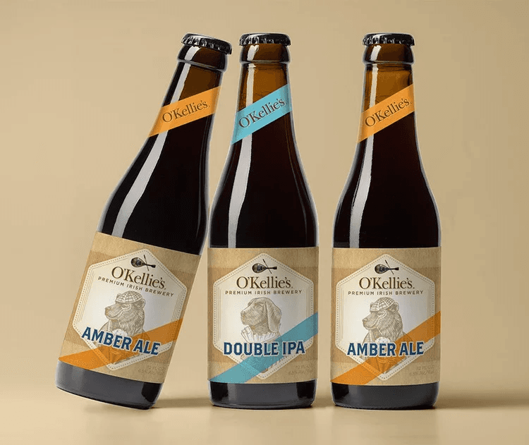
The wider spirits industry is also seeing a massive creative renaissance. Premium alcohol packaging design borrows heavily from the sophisticated luxury perfume world.
Thick, heavy glass bases. Custom-molded metallic stoppers. Intricate, hand-applied neck bands.
These physical elements create a rich tactile experience that easily justifies a higher premium price tag. Plus, the recent explosion of craft distilling brings hyper-specific storytelling to the forefront. Every detail tells a unique part of the distillery's history or botanical sourcing.
It delivers pure authenticity in every sip.
Integrating Smart Packaging Technology
The digital world and the physical retail aisle are finally colliding. Rapid adoption of smart packaging technology is transforming passive containers into active, engaging digital touchpoints.
Brands now seamlessly embed custom QR codes, hidden NFC chips, and augmented reality triggers directly into printed artwork.
Scan a local craft beer, and a high-definition video pops up showing the brewing process.
Here is exactly why this matters-
It provides virtually infinite digital space for deep brand storytelling.
It offers full, transparent supply chain traceability for specific ingredients.
It turns a simple everyday purchase into highly memorable, interactive consumer experiences.
It bridges the gap between the brand and the buyer perfectly.
Achieving Maximum Results with Minimalist Branding
Sometimes, doing significantly less does a whole lot more. The current visual landscape heavily favors the bold confidence of minimalist branding.
Overstimulated consumers are exhausted by loud, chaotic graphics. They actively crave visual quiet.
Soft, muted color palettes that soothe the eye.
Simple, highly legible, and bold typography.
Generous amounts of clean, intentional white space.
This stripped-back approach is highly effective for premium food packaging design. It confidently whispers its value instead of aggressively shouting. It deliberately strips away unnecessary visual fluff, leaving only the essential core message. Pure. Confidence. Unignorable.
Key Takeaways
Modern containers must prioritize tactile experiences and innovative structural shapes.
Eco-friendly materials are now a mandatory requirement for building brand trust.
Clean, uncluttered visual identities help products stand out on chaotic shelves.
Technology integration offers powerful new ways to engage buyers digitally.
Customized, strategic visual branding directly influences purchasing behavior and loyalty.
Final Words
The reality is, the retail shelf is a competitive place. It can be the world's best product, but if it does not attract the eye, it will stay on the shelf. A strategic food and beverage packaging design is the key to connecting your brand with your buyer. From using eco-friendly building products to considering the structural style, every detail must contribute to the narrative. It's not easy to get the formula exactly right, but trial and error, along with extensive industry expertise, are key.
When it's time to break out of the pack and into the sales world, you need professionals. Talk to Lien Design today and let's create a packaging journey that your customers can't resist.
Why You Can Trust the Experts at Lien Design
Started and run by Tom H. Lien, Lien Design is an award-winning boutique branding and package design studio based in San Diego. As a renowned art director, best-selling author, and designer with over two decades of experience, Tom is passionate about crafting visual identities that do more than look beautiful- they sell. He personally directs creative projects, combining strategic storytelling with stunning aesthetics to help consumer brands dominate the marketplace.
FAQs About Food and Beverage Packaging Design
How often should a brand update its packaging?
Brands should refresh their visual identity every three to five years to stay relevant and competitive.
What is the most important element of label creation?
Establishing a clear visual hierarchy is absolutely critical so consumers instantly recognize the core brand message.
Are eco-friendly materials more expensive to produce?
While initial costs can be slightly higher, sustainable choices heavily drive long-term consumer loyalty and sales.
Can custom bottle shapes actually improve product sales?
Yes, unique physical structures dramatically increase shelf visibility and enhance the tactile experience for the buyer.
Why is negative space important in product graphics?
Negative space prevents visual clutter and allows the most important selling points to easily stand out.