
You've got ten seconds. Maybe less. That's how long a person on a busy show floor takes to decide if your booth is worth a second look, and honestly, most exhibitors never plan around that number. They plan around brochures, giveaways, staff scripts, everything that happens after someone has already stopped. But nobody stops without a reason first.
That reason is built, or lost, in the design itself. This is where trade show booth design earns its keep, and it's what we're digging into below: what catches an eye on a crowded floor, why most booths get walked past without a second glance, and what you can actually change before your next show.
A Crowded Floor Does Not Forgive Weak First Impressions
Here's something worth sitting with for a second. By lunchtime on day one, an attendee has already passed forty or fifty booths. Maybe more if it's a big hall. Their brain has quietly started ignoring anything that looks like the last ten things they saw. Same white backdrop, same logo up top, same folding table with the same branded pens. None of it is bad, exactly. It's just invisible.
So the question isn't "does our booth look professional?" Everyone's booth looks professional now. The real question is whether yours looks like something worth interrupting a walk for. That's the whole job of trade show exhibit design, and it's a harder job than it sounds, because you're not designing for someone sitting down and paying attention. You're designing for someone mid-stride, half distracted, thinking about where to get coffee.
What Is Really Going On Inside a Visitor's Head
Nobody reads a booth the way they'd read an email. They scan it, the same fast, lazy way we all scan a phone screen at a red light. And in that scan, three things get decided almost instantly:
What is this?
Does it matter to me?
Is it worth stopping for?
If a booth can't answer those in a glance, that's it; the moment's gone. Which means every part of the booth- the height, the color, the one line of text up top- has to be pulled in the same direction. Not five ideas competing for attention. One idea, said clearly. That's really the heart of good exhibition stand design, and it's a lot simpler in theory than in practice.
Building a Booth Around How People Actually Look at Things
Once you get how people scan a room, a lot of design decisions get easier to make. A few things matter more than the rest, and it's worth being honest about which ones actually move the needle.
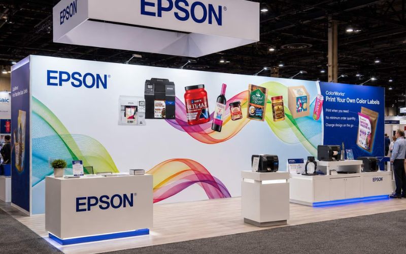
Height - A tall booth reads from across the hall before anyone's close enough to read a word on it. This is your first hook, full stop.
Color that contrasts, not matches - Two or three strong colors against a gray convention floor beat a "safe" palette every single time.
One headline, not a paragraph - Five words people can read while walking beat fifty words nobody stops to finish.
Lighting with a job to do - A backlit panel or a couple of angled spots gives a flat booth real depth, especially under harsh overhead lighting.
An entrance that doesn't make people think - Block it with furniture, and people assume it's more trouble than it's worth.
None of these work in isolation, and that's the part people miss. Height with bad lighting fades once the hall fills up. Bold color with a cluttered message just looks loud instead of clear. The booths that actually pull people in treat custom trade show booth design as one system working together, not five separate boxes to check off a list.
This Is Where Lien Exhibit Design™ Comes In

This is the part that's genuinely hard to pull off alone. Most teams don't struggle because their ideas are bad; they struggle because turning "we want people to stop and look" into an actual structure takes both a design eye and a builder's brain, and those two skill sets rarely live in the same person. That's the gap Lien Exhibit Design™ tends to fill.
Instead of starting with "what structure do we need," the approach starts with how people actually move and look on a show floor, then works backward into height, color, lighting, and layout. The booth ends up reading as one clear idea instead of a bunch of decisions bolted together after the fact.
Mistakes That Quietly Cost Booths Their Best Visitors
None of these look like a big deal on their own. Together, they add up fast.
Too much copy.
Cramming every feature onto one panel just makes people read instead of react, and nobody wants to read at a trade show.
Only designed for close range.
Looks great up close, invisible from thirty feet, and thirty feet is where most decisions actually get made.
The exact same rental furniture as the booth next door.
Nothing kills memorability faster than blending into the catalog everyone else ordered from.
A narrow or awkward entry.
If stepping in looks like a hassle, most people simply won't bother.
Forgetting the sides.
A booth designed only for the front aisle misses a good chunk of the people approaching from anywhere else.
A Few Ideas Worth Trying at Your Next Show
If you're planning your next show, a few simple moves tend to outperform the usual setup by a wide margin.
Build around one striking piece, like an oversized product replica, something people actually stop to photograph.
Add small motion, a slow rotation or subtle animated graphic. It catches the eye in a way static panels just can't.
Cut your headline down to one sentence people can read while walking past.
Layer your lighting instead of relying on one overhead source.
Walk your own layout from all four sides before the show. If it doesn't read well from the side, fix it before you're on-site.
None of these trade show booth design ideas are complicated. They just ask you to be a little more deliberate about choices that usually happen on autopilot.
How Do You Know If It Is Actually Working
Attention is not just a nice idea; it is something you can measure. Dwell time, scan-in numbers, and how many people walk in without a staff member pulling them over are all solid signs of whether a booth's design is doing its job.
If a redesign leads to more visitors stopping on their own, without anyone chasing them down, that is a strong signal the visual strategy is working, not just the sales pitch inside. Tracking these numbers from one show to the next gives teams something concrete to work from when refining their trade show exhibit design, instead of just going with a gut feeling.
Final Thought
Winning the first 10 seconds with a trade show booth design really comes down to a few fundamentals done well: clear sightlines, real contrast, and a message people can take in while walking. Get those right, and the rest of the conversation takes care of itself.
If you'd rather not figure all of this out through trial and error at your own expense, Lien Exhibit Design™ has spent years turning that first glance into something people remember well after the show ends. Reach out to us today for more details and strategies!
Frequently Asked Questions
Q1. Why do the first 10 seconds matter so much?
People scan booths while walking, so their opinion forms almost instantly. If nothing grabs them quickly, they simply keep walking.
Q2. Which colors grab the most attention?
Bold, high-contrast colors against a neutral show floor stand out best. Two or three strong shades work better than a busy, mixed palette.
Q3. Does booth height really change visibility?
Yes. A tall structure can be seen from across the hall, pulling visitors in long before they are close enough to read anything.
Q4. How much text should a booth actually have?
As little as possible. One short, bold line reads faster than paragraphs, since most people are scanning rather than stopping to read.
Q5. Can better lighting really improve attention?
It can. Layered lighting adds depth and draws the eye to key spots, which helps a booth stand out under flat convention hall lighting.